A new direction for a leader in products that improve agricultural sustainability and help with conservation.
Animal Control Products NZ develops products to control and eradicate pests. They wanted to reposition their status from being a negatively slanted ‘producer of poisons’ to instead emphasising the great achievements that their products have lead to.
Open Lab was entrusted with re-naming the company and developing a new brand strategy that would be reflected through a revitalised brand story and a modernised design aesthetic.

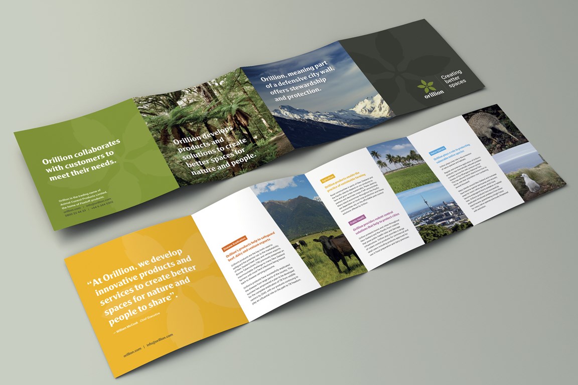
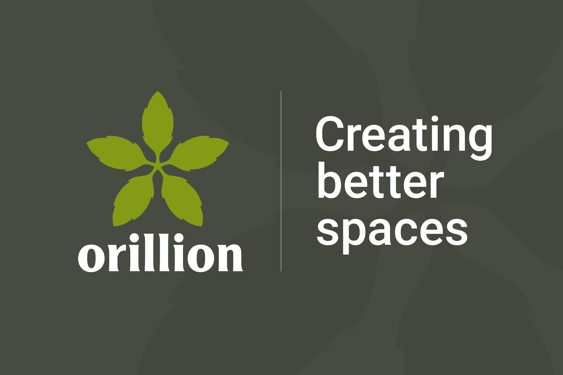
The elected name, Orillion, means ‘the defensive part of a city wall’, and conveys their role as a safeguard of native species, the environment and community. The logo is based on the whauwhaupaku, or fivefinger; a fast-growing plant used to help forests regenerate.
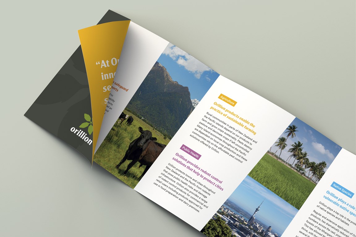
Under the primary tagline, ‘creating better spaces’, four pillars were developed - each representing a positive outcome of Orillion’s products. These pillars allow for a tailored approach when targeting the company’s diverse range of stakeholders.
Supported by a reform of the company’s tone of voice, the development of the Orillion brand has successfully redirected focus to the positive outcomes from their products’ use. With this fresh brand the company plans to launch new products and increase export sales.